PICKLEBALL: DEFINED
Brand Strategy
2024

PRATIK MEHTA | 2026 PORTFOLIO
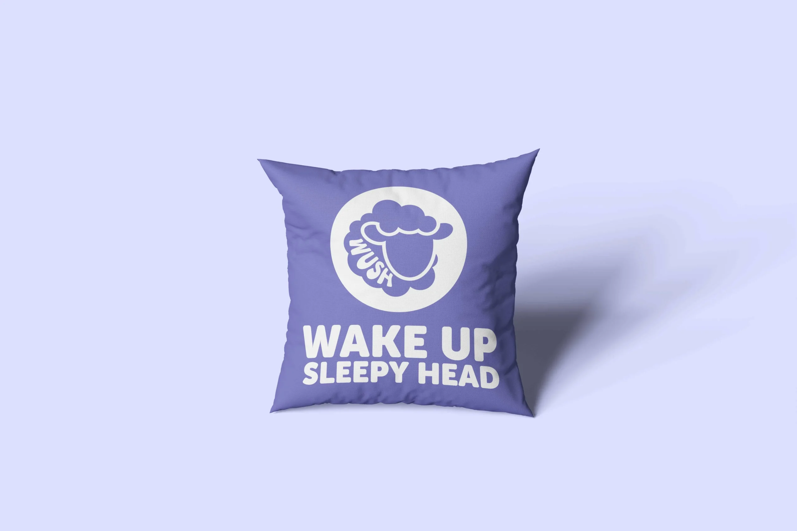
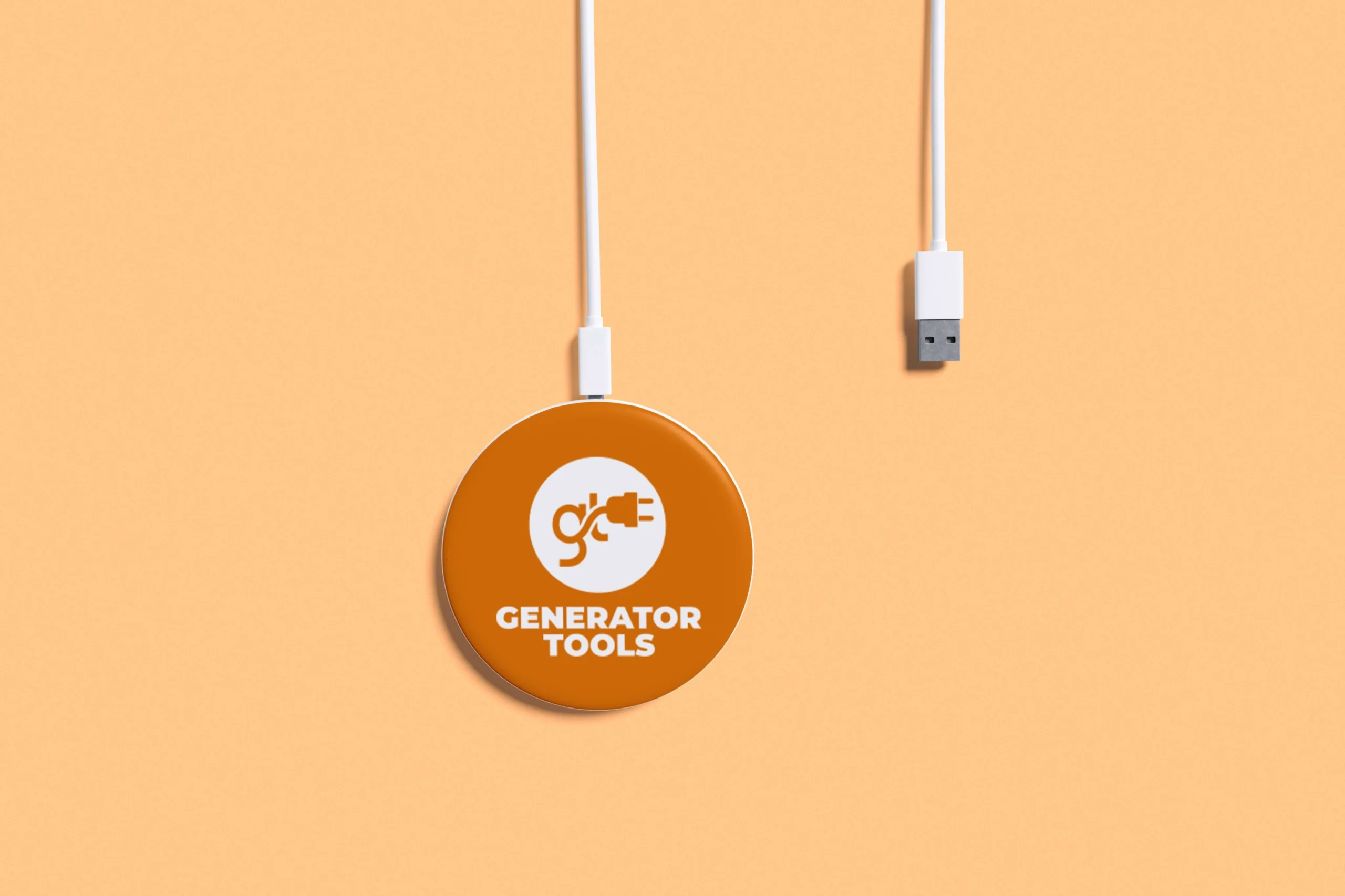
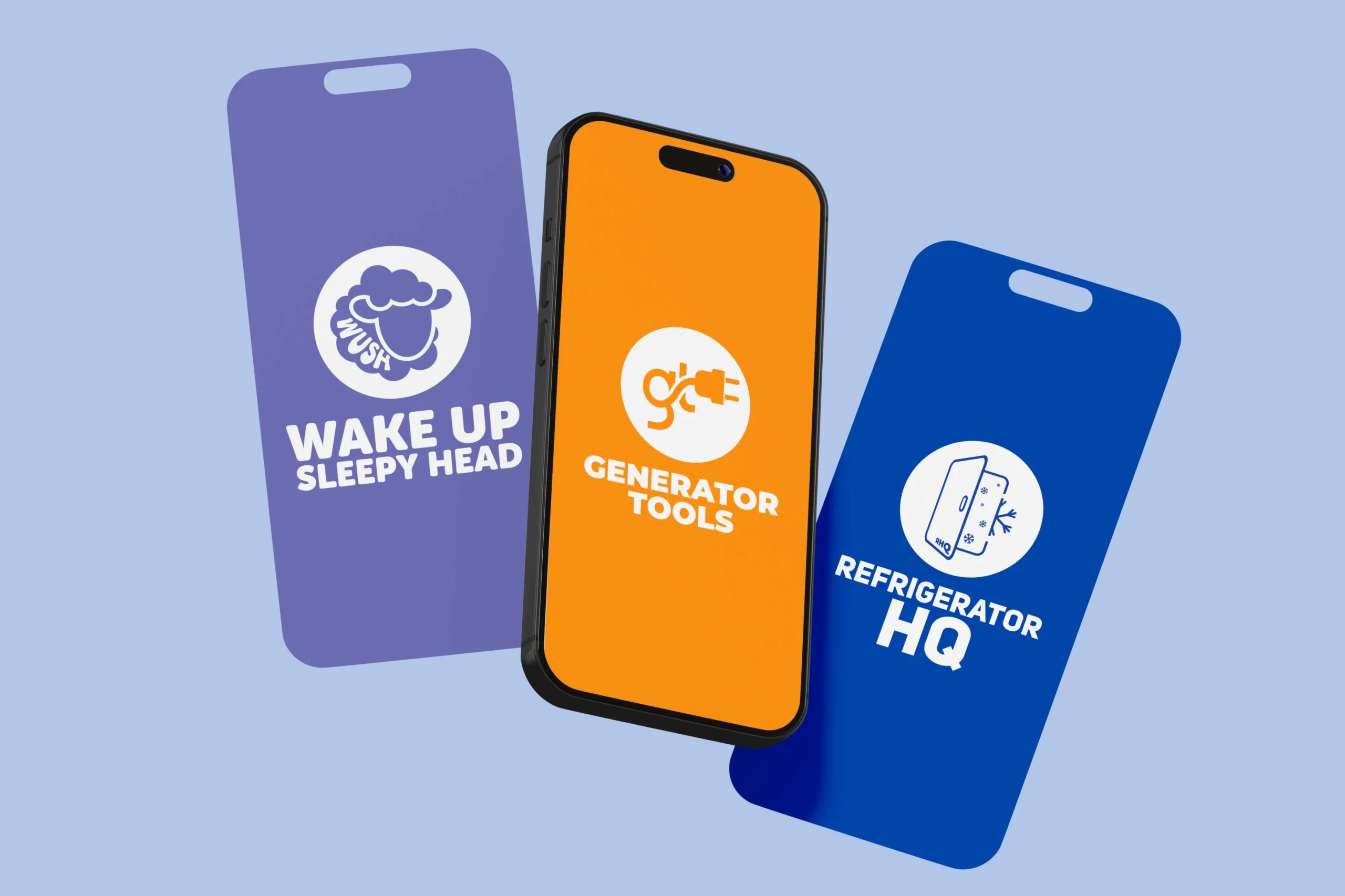
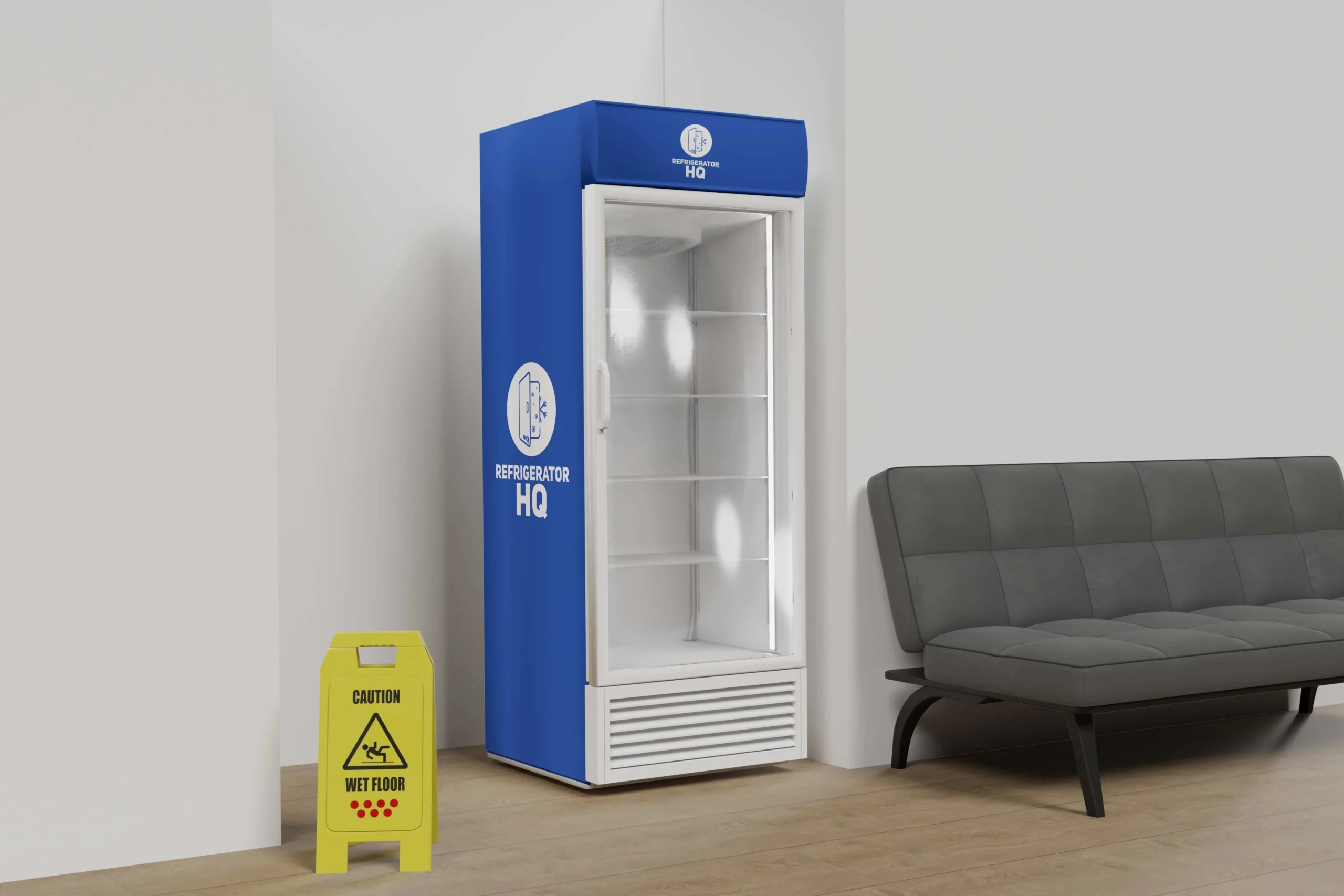
DealNews operates a network of affiliate content sites beyond its flagship platform, each targeting a specific product vertical with dedicated audiences. These sub-brands, Generator Tools, Refrigerator HQ, and Wake Up Sleepy Head, needed individual visual identities that felt distinct while remaining visually connected to the DealNews family.
Assessed each sub-brand's product focus, target audience, and tone to determine the right visual direction for each logo. Analyzed how brand families typically signal both differentiation and unity; balancing individual personality with shared system coherence. Reviewed the DealNews visual language to identify which typographic and design elements could serve as connective tissue across all three marks.
Created three distinct logos: a circular badge with an electric plug formed from the 'GT' initials for Generator Tools; a fridge silhouette with snowflake details for Refrigerator HQ; and a playful sheep illustration for Wake Up Sleepy Head. Each mark was designed with a unique color palette and personality to reflect its specific niche, while all three shared consistent typeface choices and structural logic to signal their network relationship. Delivered each logo across multiple formats optimized for web, app icons, and social avatars.
Built out basic brand guideline documentation for each sub-brand covering color usage, logo clearspace, and approved applications. Adapted assets for mobile app icon formats, ensuring all three logos read clearly at small sizes across iOS and Android. Coordinated rollout across digital touchpoints including social headers, website favicons, and email branding.
The creative challenge was giving three niche-focused sites enough individual identity to build their own audience loyalty, while ensuring a visitor could still intuitively connect them back to the DealNews network. The solution was a family branding model: distinct faces, shared bones. Each logo is memorable on its own terms, yet all three share enough visual DNA to communicate a unified network without requiring explicit co-branding.